Why they approached us
OMAG's existing branding and website were outdated, failing to capture the depth of their expertise and the relationships they cultivate.
They needed:
- A modernized brand identity that aligned with their core values and mission.
- A website that was both visually stunning and easy to navigate, with a clear structure for showcasing projects.
- Professional photography to authentically represent their team and their work.
the challenges
Through our discovery process, we identified several critical areas to address:
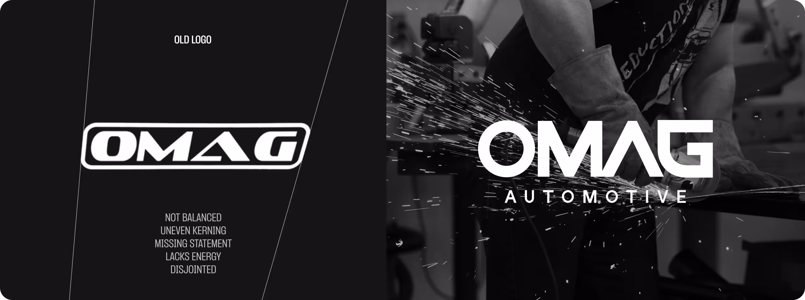
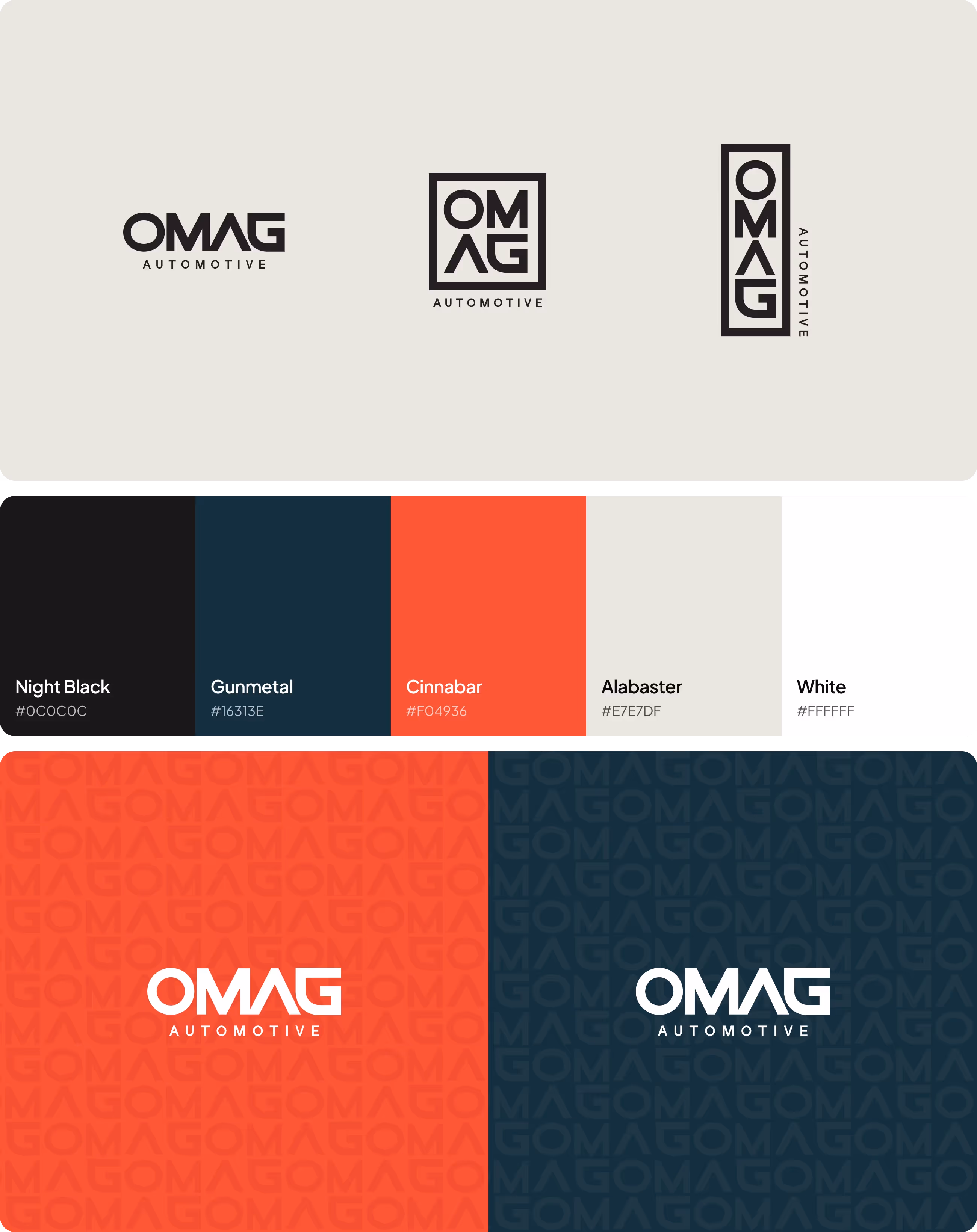
- Outdated Brand Identity: OMAG's logo, colors, and overall branding didn’t reflect their modern and professional approach.
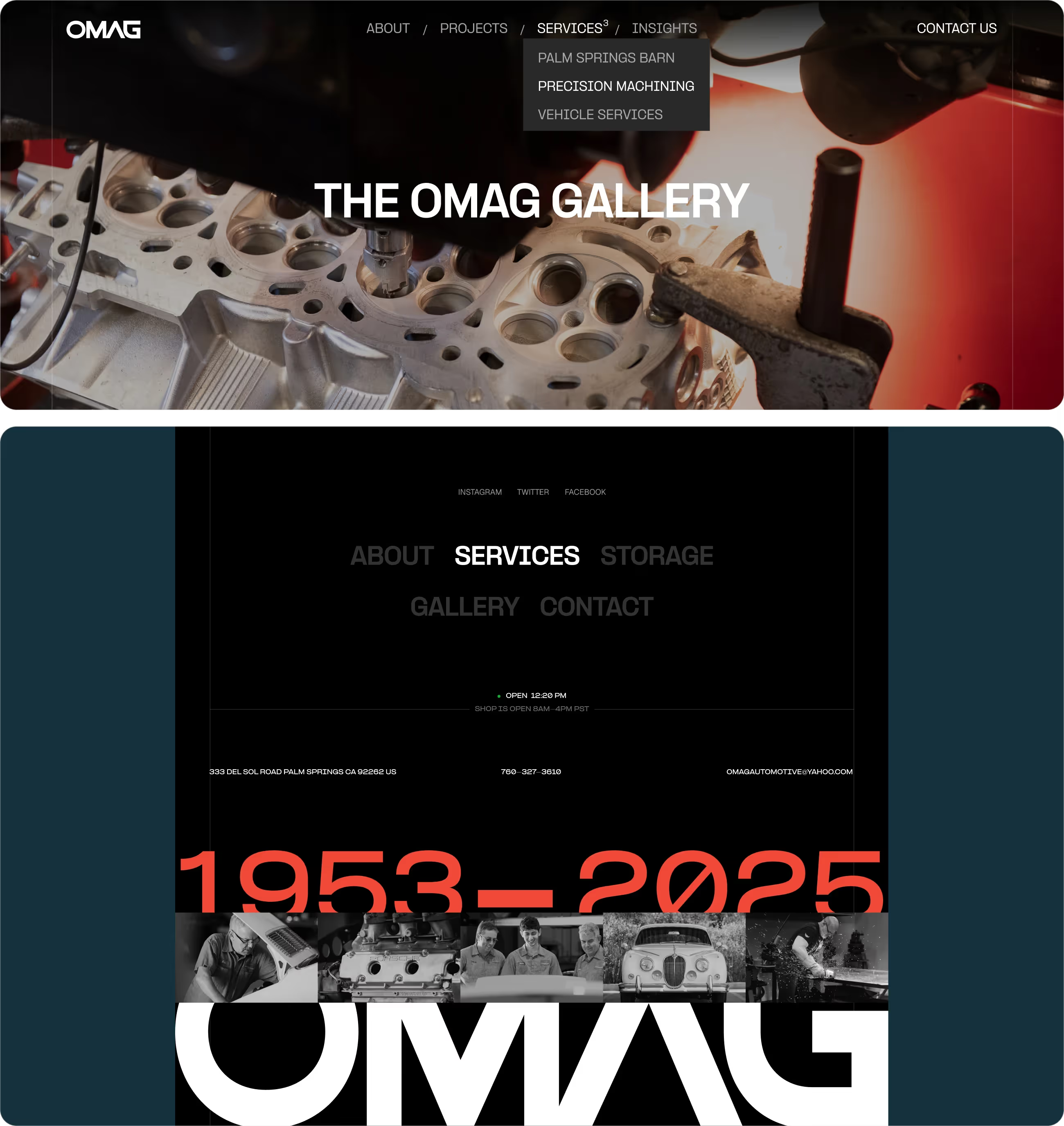
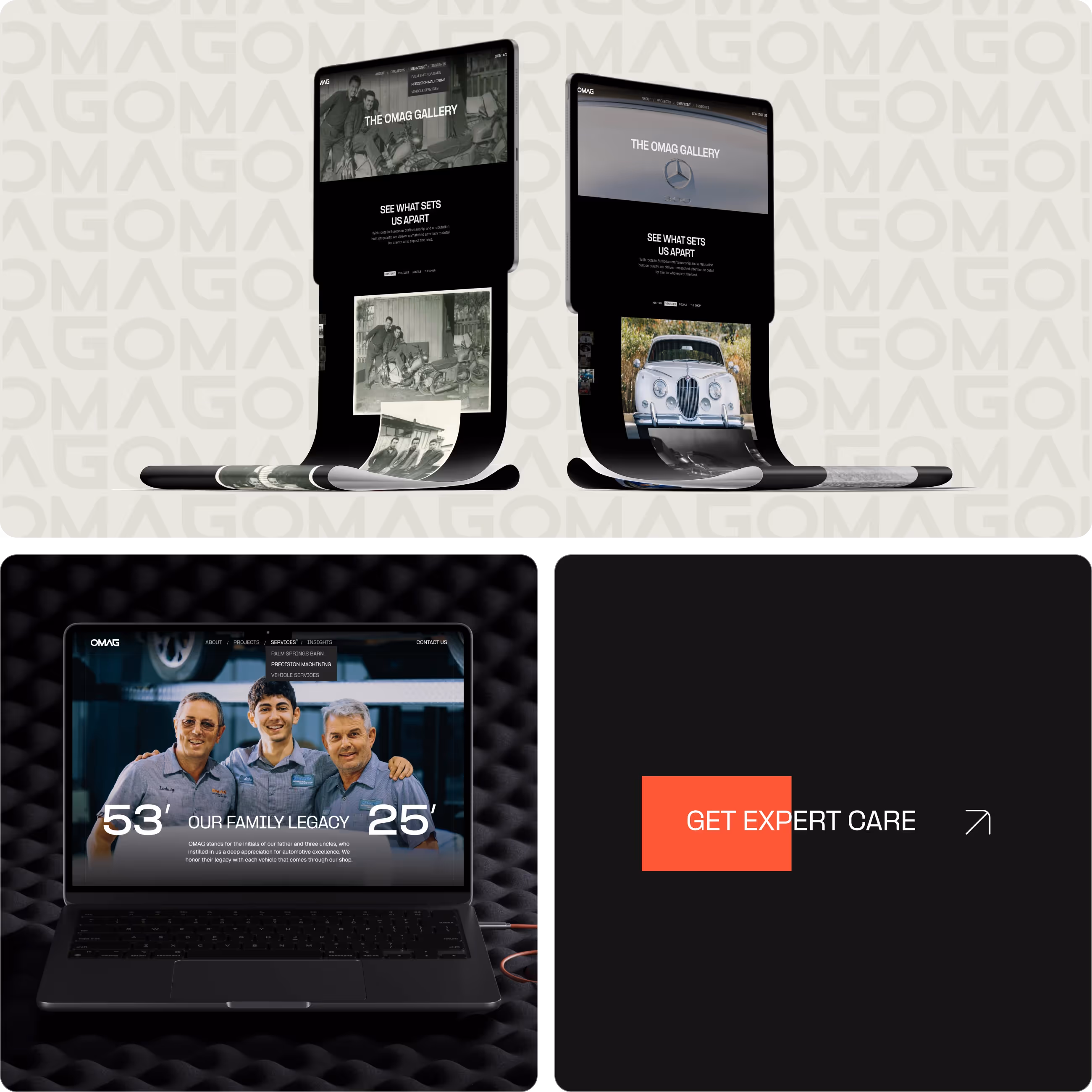
- Unstructured Website Navigation: Their site lacked clarity, making it hard for users to understand their services and expertise.
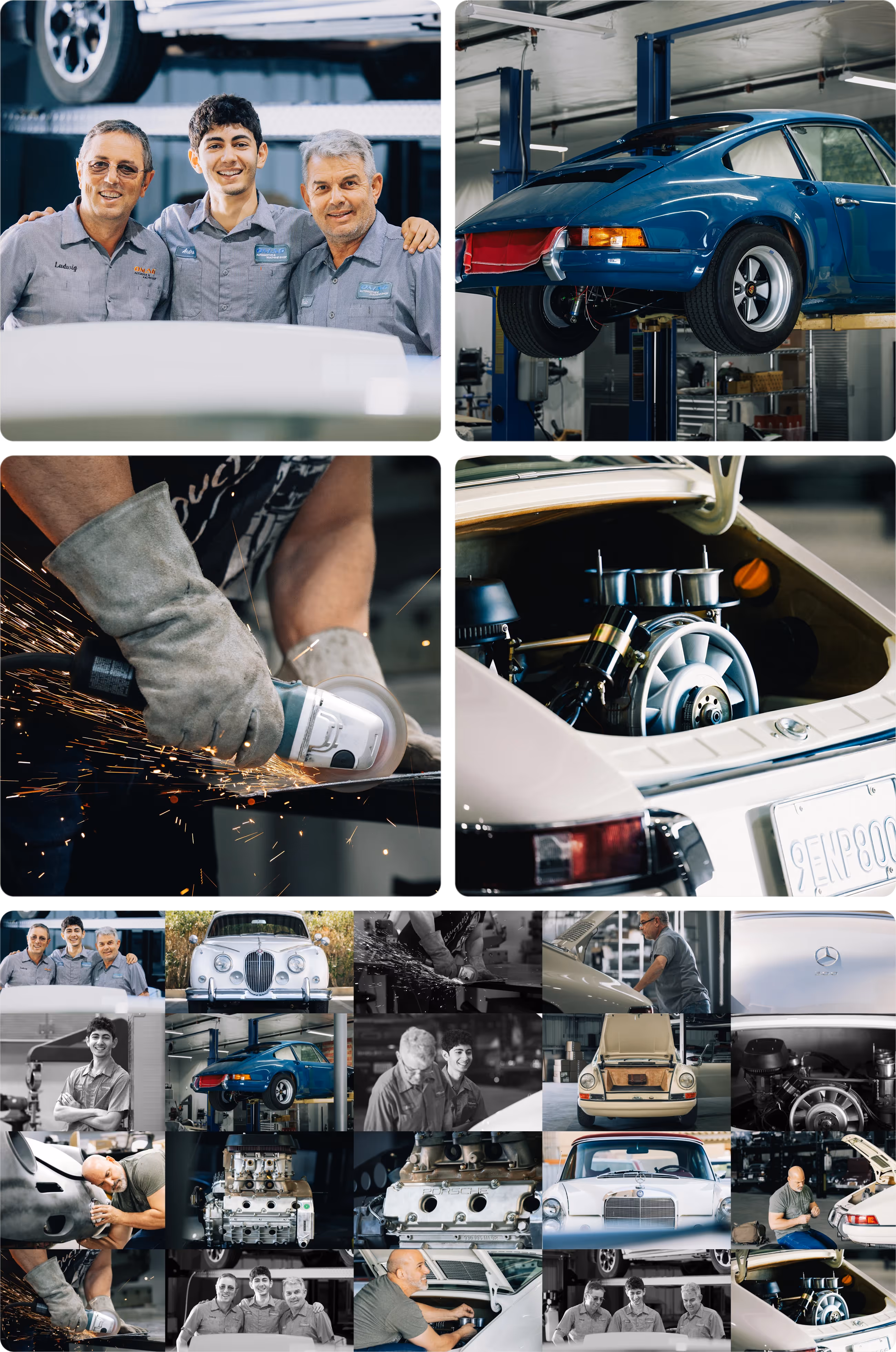
- Lack of Visual Representation: They lacked high-quality imagery that could help humanize their brand and tell their story.
- Underwhelming User Experience: The website's design and functionality didn’t match the high caliber of their work, leading to missed opportunities to connect with potential clients.

the result
We worked closely with OMAG to reimagine their brand and digital presence. Key steps included:
- Complete Rebrand: We created a new logo, color palette, typography, and brand guidelines to reflect their professionalism and modern approach.
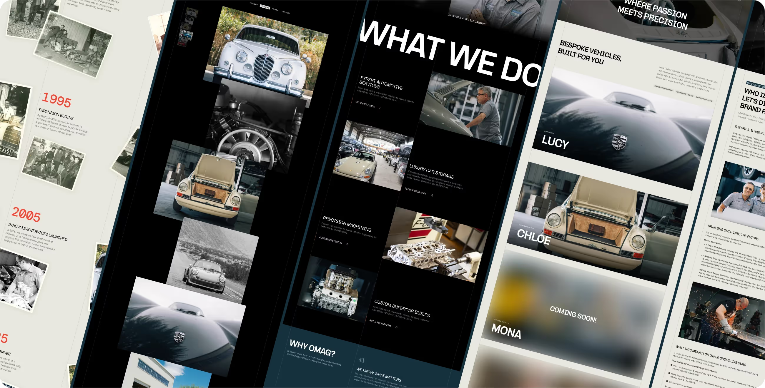
- New Website Design: We designed and developed a user-friendly website with a clear structure to highlight their portfolio, services, team, and tell their story.
- Photography: Our team captured professional photography to showcase OMAG’s leadership and services to create an authentic connection with their audience.
- Streamlined Content: We simplified their messaging and focused on communicating their values and expertise effectively.
the collaboration
OMAG now has a refreshed brand and digital presence that matches their reputation and vision.
Highlights include:
- A Professional, Cohesive Brand Identity: The new logo, colors, and typography create a polished and memorable impression across all touchpoints.
- A User-Friendly Website: The site is easy to navigate, visually compelling, and structured to showcase their portfolio and team effectively.
- Authentic Storytelling Through Photography: The professional images humanize their brand, building trust with potential clients.
- Enhanced Client Engagement: The rebrand and website have positioned OMAG as a leader in their industry, enabling them to connect with their target audience more effectively and confidently.
the collaboration
OMAG’s transformation is a testament to how thoughtful design and branding can elevate a company’s presence, making their story resonate and their work shine.