Speech therapy PD
See all projects

Wells Collins came to us with an existing site that felt static and fragmented — excellent projects, but a digital experience that didn’t elevate them. Our challenge was to reimagine the entire site as a living portfolio. A space that communicates both the intellectual depth of Wells’s thinking and the aesthetic precision of his output. The goal: become not just a digital resume, but a brand experience in its own right.
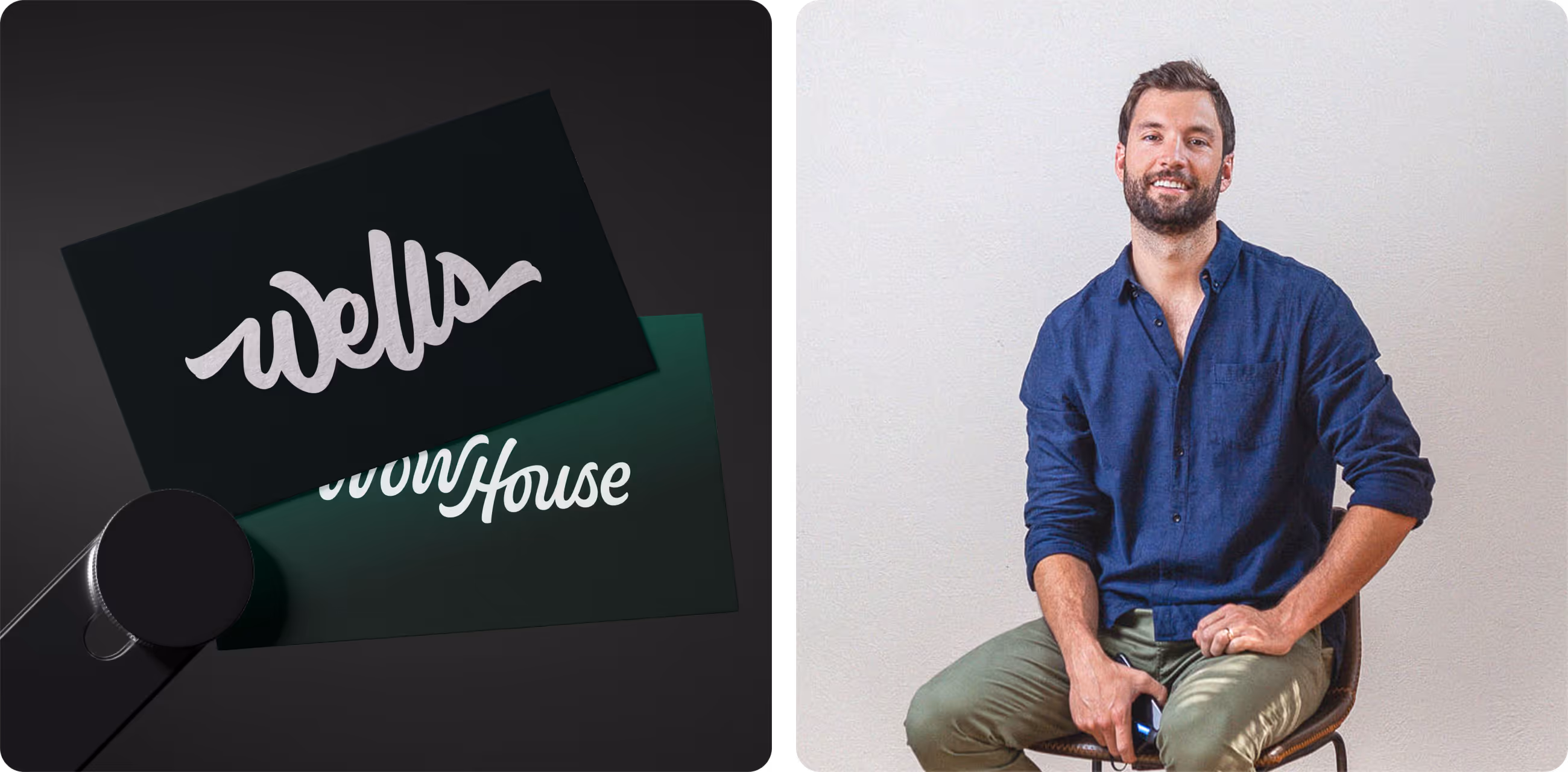
Taking cues from Wells’s personal style — restrained elegance, intelligent hierarchy, and surprising details — we built a visual language for the site that feels architectural and intuitive. It’s not flashy for the sake of flash — it’s deliberate, just like brand design should be.

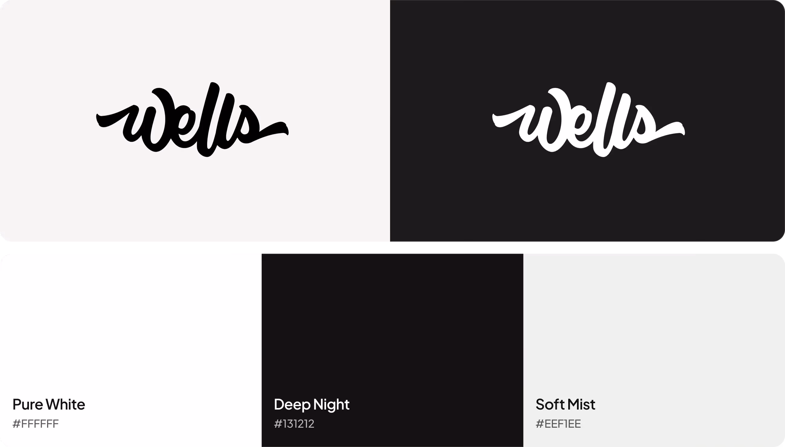
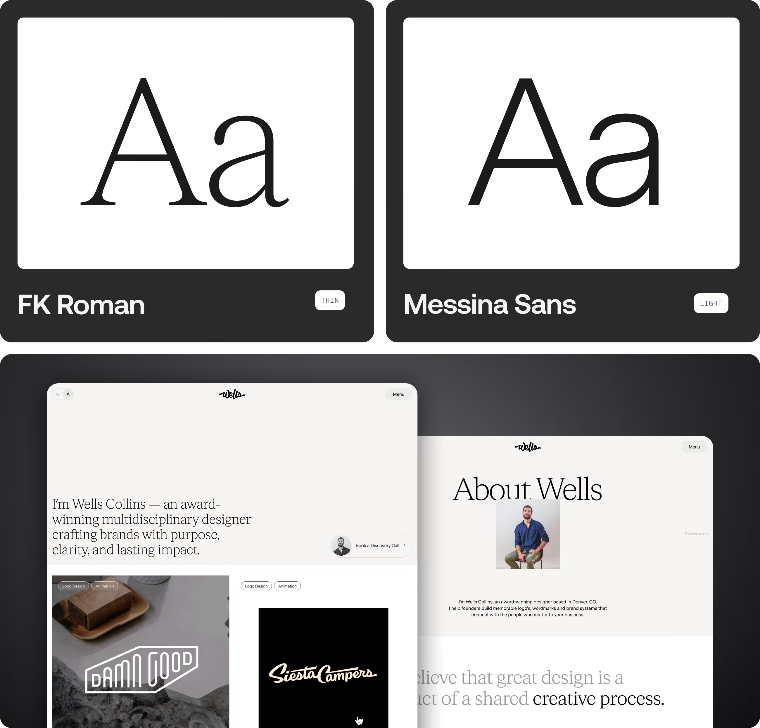
Good brand design doesn't shout — it holds. The wordmark draws from Wells's own handwriting, refined until it felt inevitable. The palette was chosen the same way: not for trend, but for tension. Graphite and Black anchor the system. Coral Red breaks it open — just enough. The result is a mark that's quiet until it isn't.
FK Roman brings editorial weight to the moments that earn it — the headlines, the openers, the lines meant to land. Messina Sans handles everything else: clean, precise, invisible in the best way. Both set at their lightest weights on purpose. The restraint is the style.
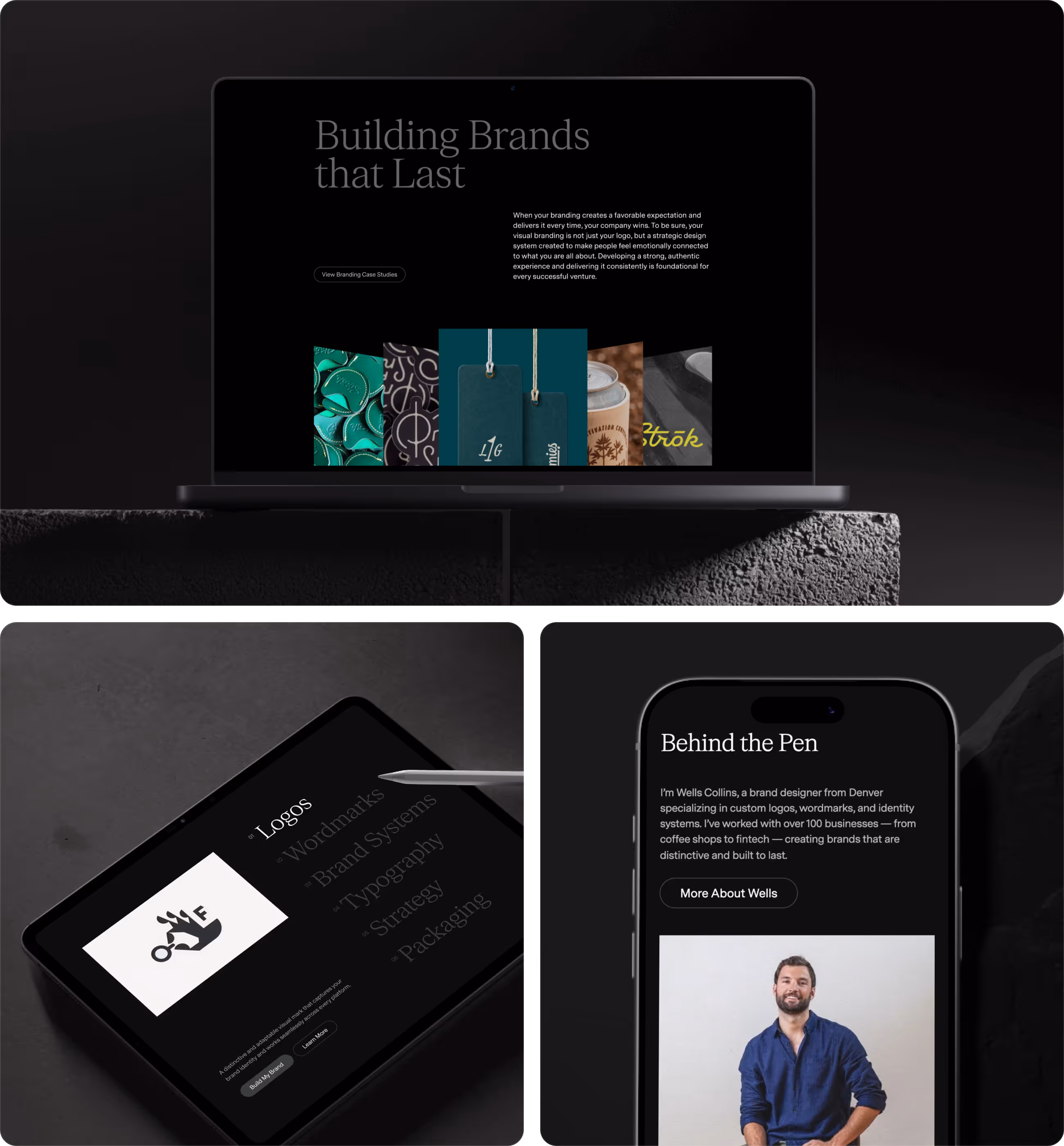
Instead of templated blocks, we created a layout that guides the eye. Each section works like a chapter in a narrative:

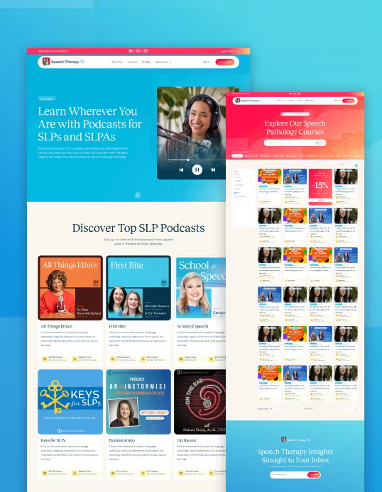
We didn’t just redesign how the site looks — we redesigned how it feels to move through the work. The navigation is intuitive but unobtrusive, letting visitors focus on the craft rather than mechanics. Scrolling feels intentional, with custom motion cues that guide without distracting.

Every design choice on Wells Collins’ site is intentional, bridging craft and experience. From custom motion cues to modular layouts, each solution serves the work, not the interface. Interactive transitions highlight the nuances of the projects, while subtle overlays and contextual storytelling keep the visitor engaged without distraction. The result is a system that adapts, responds, and presents Wells’s thinking and aesthetics in a way that feels natural — a portfolio that’s alive, not just displayed.

The new website isn’t a static gallery — it’s a living reflection of Wells’s design philosophy. It elevates his work, tells his story, and lets his talent take center stage. Potential clients are drawn into the experience, not just shown it.
The redesign not only modernized the visual experience — it repositioned the brand in digital space: Wade beyond portfolio, into identity showcase; from static pages into dynamic conversation.