Table of contents



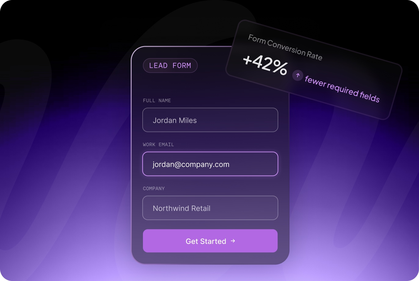
A website can generate the right traffic, communicate a compelling offer, and build trust with potential customers, only to lose qualified prospects at the final step: the form.
For businesses that rely on their website for leads, small decisions within a form can have an outsized effect on marketing performance. Too many questions can discourage prospects from completing it. Too few can leave sales teams sorting through inquiries that were never a good fit. Effective form optimization for conversions finds the right balance, making it easy for qualified prospects to reach out while collecting enough information to make the resulting lead useful.
That balance becomes especially important for businesses selling higher-value services, complex solutions, or products with longer sales cycles. A higher submission count has limited value if the additional inquiries are not qualified.
The goal is to design forms around the quality of the opportunity and the experience of the person completing them. Here is how businesses can improve form performance without sacrificing the information their sales teams actually need.
Forms tend to receive far less strategic attention than the pages surrounding them. Businesses spend significant time refining headlines, service descriptions, case studies, navigation, and calls to action, then use a standard contact form with little consideration for what happens once someone decides to inquire.
That creates an opportunity.
By the time a visitor reaches a contact or inquiry form, much of the difficult work has already happened. They have found the business, explored the website, developed some level of trust, and decided they are interested enough to take action. Unnecessary friction at this stage can waste the value created by everything that came before it.
Strong website form design makes the next step feel clear and proportionate to what the visitor is asking for. Someone requesting a downloadable resource may reasonably expect to provide an email address. Someone requesting a consultation for a high-value service may be comfortable sharing considerably more information.
The form should reflect the context of the conversion.
This is also why conversion rate alone can be misleading when evaluating forms. If simplifying a form increases submissions by 30% but most of those additional inquiries are poor fits, the business has not necessarily improved its lead generation performance. Marketing and sales teams should consider submission volume alongside lead quality, sales acceptance, and eventual revenue.
It is also worth noting that form problems rarely exist in isolation. In many cases, low form conversion rates are a symptom of deeper issues across the page or site, including unclear messaging, weak trust signals, or a user experience that creates doubt before a visitor even reaches the form. The real cost of an outdated website covers how these compounding problems affect lead generation across the entire funnel, not just at the form level.
Shorter forms generally require less effort to complete. That can make them useful when the primary objective is maximizing participation, such as newsletter subscriptions, resource downloads, or other low-commitment actions.
Higher-value inquiries require a different approach.
A B2B company may need to know the prospect's company, project type, budget, timeline, or current challenges before determining whether a conversation makes sense. Removing all of those fields to increase form completions can transfer the work elsewhere. Sales then spends time manually qualifying inquiries that the website could have helped identify.
The right form length depends on what happens after submission.
Ask what your team genuinely needs to know before taking the next step. If a piece of information changes who receives the inquiry, whether the lead is qualified, or how your team prepares for the conversation, it may deserve a place on the form. If nobody uses the information, reconsider why you are asking for it.
Good lead form best practices therefore require more nuance than simply minimizing the number of fields. The objective is to minimize unnecessary effort while preserving useful qualification data.
One of the most effective ways to approach form optimization for conversions is to evaluate each field independently. For every question, ask: what will we do differently based on this answer?
Name: A name is usually reasonable for a direct sales inquiry. In most cases, a single name field is sufficient unless your CRM or internal workflow specifically requires first and last names separately.
Email: Email is generally essential when the business needs to respond to an inquiry. A business email requirement can sometimes help with B2B qualification, although businesses should consider whether it could exclude legitimate prospects who use a personal address.
Phone Number: A required phone number can introduce unnecessary friction when the next step will initially happen over email. If your sales process genuinely depends on calling every lead, requiring it may make sense. Otherwise, making the field optional gives prospects control over how they are contacted.
Company Name: For B2B businesses, company name can provide useful context with relatively little effort from the prospect. It also gives the sales team an opportunity to research the organization before responding.
Budget: Budget questions can be valuable when project costs vary significantly or when minimum engagement levels are important. Clearly defined ranges are generally easier to answer than asking prospects to type an exact figure. The ranges should correspond to actual decisions your team makes. If a smaller inquiry and a larger inquiry receive meaningfully different services or sales treatment, asking about budget provides useful qualification data.
Timeline: Timeline can help identify urgency and improve sales preparation. Options such as "As soon as possible," "1 to 3 months," "3 to 6 months," and "Exploring options" can provide enough context without requiring the prospect to commit to an exact date.
Project or Service Type: This is particularly useful for businesses offering multiple services. Selecting a project type can route inquiries to the appropriate person and allow subsequent questions to adapt to the prospect's needs.
Open-Ended Project Information: A short prompt such as "Tell us a little about your project" gives prospects an opportunity to provide context that predefined fields cannot capture. Avoid requiring an essay. The purpose is to start the conversation, and prospects can provide additional detail later.
Information You Do Not Use: These are the easiest fields to remove. If your form asks for job title, company size, referral source, address, or industry simply because the template included it, determine whether that data actually affects your process. Every question creates effort and each should earn its place.
For higher-ticket services, a longer form may be useful for qualification but visually intimidating when presented all at once.
Multi-step forms can make that experience more manageable by dividing questions into smaller groups. A website might first ask what service the prospect needs, then gather project information, followed by contact details.
For example:
What can we help you with? Tell us about the project. What is your approximate budget and timeline? How can we contact you?
A multi-step format is not automatically better. A relatively simple form with five or six straightforward fields may be easier to understand on a single page. Adding multiple screens to a short form can introduce extra clicks without providing meaningful value.
The decision should reflect complexity. When qualifying leads through forms requires several pieces of information, breaking the process into logical stages can make a longer inquiry feel easier to complete.
This is one of the form considerations covered as part of the broader custom website design process at Wow House Studio. Form structure decisions are made at the architecture and UX level, not as an afterthought once the visual design is finished.
The questions themselves are only part of the experience. Presentation can determine whether a form feels simple or demanding.
Make the Purpose Clear: Visitors should understand what they are submitting and what will happen afterward. "Submit" provides very little context. A button such as "Request a Consultation," "Get My Website Review," or "Send Project Details" communicates the action more clearly. Supporting copy can also set expectations. If someone can expect a response within a certain timeframe, tell them.
Keep Labels Clear: Field labels should be specific and easy to understand. Avoid internal terminology or clever language that requires interpretation. Placeholder text can provide an example, but important instructions should remain visible rather than disappearing once the visitor starts typing.
Use Progress Indicators for Multi-Step Forms: If a form has multiple stages, show visitors where they are in the process. A simple "Step 2 of 4" can make the remaining effort predictable and reduce uncertainty.
Design for Mobile Completion: Forms that work comfortably on desktop can become frustrating on a phone. Fields should be large enough to tap, spacing should prevent accidental selections, and the form should not require excessive scrolling or complicated interactions. Selecting the appropriate input type also makes completion easier by displaying the correct mobile keyboard for fields such as email addresses and phone numbers.
Make Errors Easy to Fix: If someone enters information incorrectly, explain what needs to be corrected and identify the relevant field clearly. A generic error after someone has completed an entire form creates avoidable frustration, particularly when their entered information is lost.
Thoughtful UX lowers the effort required to complete the action without removing valuable qualification questions. For businesses exploring how this level of detail applies across a full website build, the Webflow development services complete guide covers how Webflow's native form and interaction capabilities support this kind of intentional design at the component level.
Conditional logic is particularly valuable for businesses with multiple services, customer types, or project requirements.
Instead of showing every possible question to every visitor, the form can reveal relevant fields based on previous answers.
For example, a web design agency might begin by asking: what are you interested in? A prospect who selects "Website Redesign" could then see questions about their existing website, project goals, and desired timeline. Someone who selects "Ongoing Website Support" could instead see questions about their current platform and the type of support they need.
Both prospects provide useful qualification information without having to navigate questions that do not apply to them.
Conditional logic can also improve internal operations. Responses can route leads to different team members, trigger appropriate CRM workflows, or categorize opportunities automatically.
For growing businesses, this makes qualifying leads through forms useful on both sides of the submission. Prospects get a more relevant experience while internal teams receive cleaner, better organized information.
This kind of intelligent form architecture is one of the reasons working with a capable Webflow development agency matters more than most clients initially expect. The platform supports conditional logic and custom form behavior natively in ways that template-based builders consistently cannot match without workarounds. Understanding how to choose the right Webflow agency for a project that requires this level of detail is worth doing carefully before committing to a direction.
There is no universal form that will perform best for every business. Audience, traffic source, offer, purchase value, and sales process all influence how much information visitors are willing to provide.
Testing allows businesses to make decisions based on actual user behavior rather than assumptions.
Start with a clear hypothesis. For example: making the phone number optional will increase qualified form submissions because prospects do not need to commit to a phone conversation immediately. Then change that variable while keeping the rest of the experience as consistent as possible.
Potential tests include required vs. optional phone number, single-page vs. multi-step form structure, different CTA button language, budget question vs. no budget question, number of required fields, form placement on the page, and supporting copy positioned around the form.
Avoid changing several major elements simultaneously if you want to understand what caused the result.
More importantly, measure the outcome beyond the initial submission. Suppose Version B produces 25% more inquiries. That appears to be a clear winner until sales discovers that nearly all of the additional leads are unqualified. A more useful measurement framework connects form submissions to qualified leads, sales opportunities, and eventual customers rather than treating every submission as equally valuable.
Businesses with lower lead volume may need to run tests for longer periods before drawing conclusions. Small sample sizes can make normal fluctuations appear meaningful. Testing should also continue after a winning variation is identified, since customer behavior, traffic sources, offers, and business priorities change over time.
The strongest forms make it easy for the right prospects to take the next step while collecting the information the business needs to respond effectively.
That requires understanding the sales process behind the form. Determine which information genuinely helps your team qualify opportunities, remove questions that serve no purpose, and use thoughtful design to make the remaining experience as clear as possible.
Effective form optimization for conversions should improve the quality of the entire lead generation process. More submissions can be valuable, but more qualified opportunities are what create meaningful business results.
If your forms are generating too few inquiries, attracting the wrong prospects, or losing visitors at the point of conversion, the surrounding page likely deserves attention as well. The why choose a Webflow development agency guide is a useful reference for understanding how platform capability connects to the kind of intentional form and conversion design described throughout this post.
For businesses ready to take a closer look at what their current website is doing well and where it is losing conversions, the freebies page has resources to support that audit process, or you can get in touch directly to discuss a specific project. You can also learn more about the team and approach at Wow House Studio before starting a conversation, or review pricing to understand how engagements are structured.
What is form optimization for conversions?
Form optimization for conversions is the process of improving a website form to increase successful submissions while maintaining the quality and usefulness of the leads it generates. It can involve changing fields, layout, messaging, qualification questions, mobile usability, conditional logic, and other elements of the form experience.
How many fields should a lead form have?
There is no ideal number of fields for every lead form. The appropriate length depends on the action, value of the service, and information required by the sales process. A newsletter signup may only need an email address, while a high-value B2B inquiry may reasonably require project type, budget, timeline, and company information.
Do shorter forms convert better?
Reducing unnecessary fields can lower the effort required to submit a form, but submission volume should be evaluated alongside lead quality. Removing important qualification questions may increase inquiries while creating additional work for sales. Strong lead form best practices focus on removing unnecessary friction rather than pursuing the fewest possible fields.
How can businesses reduce form abandonment?
Businesses can reduce form abandonment by using clear labels, limiting unnecessary required fields, improving mobile usability, providing useful error messages, setting expectations about what happens after submission, and using progress indicators when forms contain multiple steps.
Should B2B websites ask for budget on contact forms?
Budget can be useful when it meaningfully affects qualification, service recommendations, or the sales process. Using realistic budget ranges makes the question easier to answer while giving the business enough information to determine whether an opportunity is a potential fit.