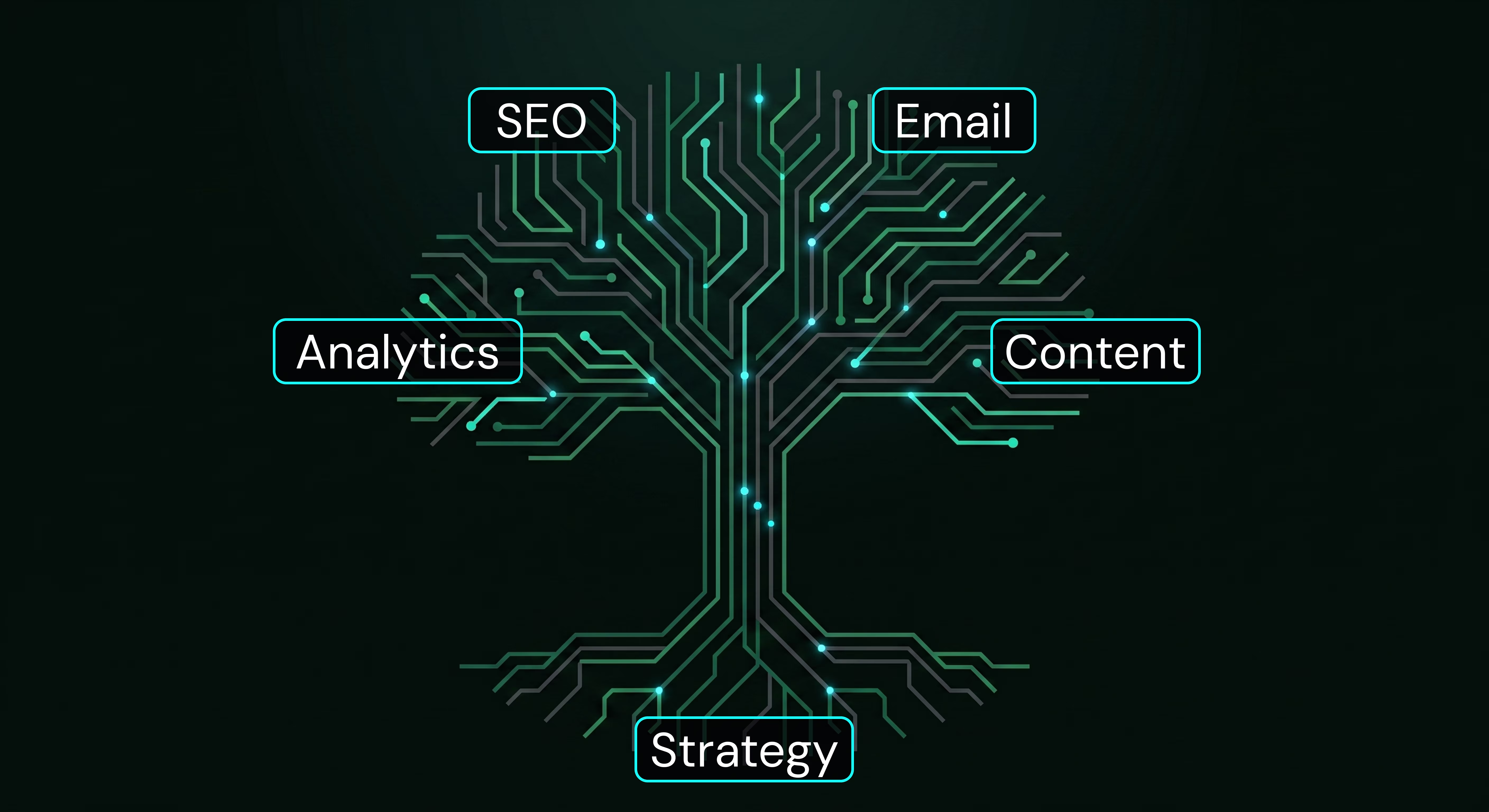
Table of contents


When a landing page isn't converting, you can almost always trace the problem back to a single moment where someone pauses.
They arrive on the page and have to figure out what they're looking at, whether it applies to them, and what they're supposed to do next. That hesitation doesn't last long. Most people leave instead of working through it.
Landing page design for lead generation is really about removing that friction so the experience feels immediate and clear from the first second. When it's working, the page feels easy to move through. Nothing feels unnecessary. There's no point where someone has to stop and think.
That's the standard every page should be measured against, and it's what separates wow web design from pages that look polished but quietly underperform.
A regular page on a website is built for exploration. Navigation, multiple sections, and different entry points all make sense in that context because visitors are browsing.
A landing page is different because someone is arriving with intent. They clicked something specific, whether that was a paid ad, a search result, or a direct link, and they're expecting to see exactly what they clicked for. If that connection isn't immediate, they won't stick around to figure it out.
This is where landing page design for lead generation tends to fall apart. The page tries to function like a full website instead of a focused experience, which introduces unnecessary decisions. Once you give someone multiple directions to choose from, you've made the process harder than it needs to be.
The more effective approach is to keep everything aligned around a single outcome and remove anything that doesn't directly support it. This same principle applies whether you're building something new or working through a website redesign checklist to improve an existing page.
When you study high-converting landing page designs across different industries, the structure turns out to be fairly consistent, even when the visual design looks completely different on the surface.
What matters is how the page guides someone from landing to action.
The first section of the page does most of the heavy lifting. That's where someone decides whether to keep going or leave.
Without scrolling, a visitor should be able to understand what you offer, who it's for, and what they can do next. If any of those three things require extra effort to figure out, you're losing people earlier than you think.
A simple test: look at your page with fresh eyes and ask whether someone completely new would understand it within two seconds. If the answer is no, that's where the work starts.
The headline should feel like a continuation of whatever brought someone to the page in the first place.
If someone searched for a specific phrase related to landing page design for lead generation and your headline is vague or trying too hard to be clever, it creates a disconnect that's easy to overlook but hard to recover from.
Clarity outperforms creativity here, especially for service businesses where someone is actively evaluating whether you're the right fit. This is one of the core website redesign SEO considerations that gets underestimated most often. Headlines carry keyword signals to search engines and trust signals to humans at the same time.
People don't wait until the end of a page to decide whether they trust you. They're scanning for signals immediately, and if they don't find anything reassuring early, they're more likely to leave than to keep reading.
That's why proof needs to live near the top of the page. It can take several forms depending on the business:
Recognizable client logos placed above the fold signal social proof without asking for any extra effort from the visitor.
Short testimonials with specific, measurable outcomes carry more weight than general praise. "Our conversion rate increased by 300% in six months" lands differently than "great service."
Quantified results presented as a callout or stat block give visitors an instant reason to stay.
Even a small amount of well-placed credibility makes the rest of the page easier to engage with. This is also one of the key considerations when you're rethinking custom website design from the ground up rather than patching an existing layout.
Every landing page should revolve around a single action, whether that's booking a call, submitting a form, or requesting information.
You can repeat that action at multiple points throughout the page, but it should always point toward the same outcome. When multiple actions are introduced that serve different purposes, it creates friction and slows people down at exactly the moment they should be moving forward.
This is one of the most consistent principles across landing page design best practices because simplicity makes it easier for someone to follow through.
Service businesses face a specific challenge. They're asking someone to trust them before there's any direct experience to rely on. That makes structure and clarity more important, not less.
There isn't a fixed number, but there is a real tradeoff between volume and quality.
Shorter forms tend to bring in more submissions. Longer forms can help filter out leads that aren't a good fit. The right balance depends on what happens after someone submits and how much context you need to move the conversation forward.
A practical way to think about it: simpler services benefit from fewer fields, higher-ticket services often justify a couple of qualifying questions, and longer sales cycles tend to benefit from gathering more detail upfront.
This is one area where small adjustments make a noticeable difference over time, and it's worth testing rather than guessing.
Most visitors are arriving from their phones. That changes how a page should be designed from the very beginning, not adjusted after the fact.
Mobile-first thinking means considering how quickly someone can read the headline, how easy it is to tap a button with their thumb, and how naturally the page flows from one section to the next. When mobile is treated as an afterthought, it shows up immediately in bounce rates.
When you're working through how to design a landing page that converts, mobile should be part of the initial structure. This is especially true when you consider that wow factor web design on desktop often depends on layout decisions that need to be rethought entirely for a 390-pixel screen.
Load time is something visitors don't always consciously notice, but it affects behavior almost immediately.
If a page takes more than a few seconds to load, a significant percentage of people leave before they've had any chance to engage with it. This usually comes down to unoptimized images, unnecessary animations, or choices made at the structural level during development.
Improving speed doesn't require rebuilding the page from scratch, but it does require paying attention to how everything is put together. This is one of the site redesign SEO checklist items that agencies often flag as low effort but high impact.
From a practical standpoint, Webflow landing page design gives you control over both the structure and the visual design without being locked into templates.
That flexibility matters because landing pages shouldn't stay static. They should evolve based on performance data.
Being able to adjust layout, refine messaging, or update form structure without depending on a developer for every change makes it much easier to improve results over time. This is one of the core reasons our Webflow design and development service produces results that compound instead of plateau.
It's also worth noting that Webflow's clean code structure is a direct advantage from an SEO standpoint. Pages load faster, semantic markup is easier to implement, and there's no plugin bloat dragging down performance scores.
Looking at real projects makes this easier to understand.
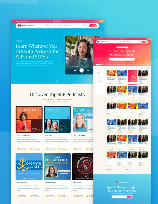
On Speech Therapy PD, the focus wasn't on making the site more complex or adding more content. The focus was on making it easier for users to understand where to go and what to do next. Once that path was clearer and the experience was simplified, conversion rates from organic traffic increased by over 300% within the first six months.
That result came from applying the same principles discussed throughout this post: a clear above-the-fold message, trust signals placed early, a single focused call to action, and a page structure that removed friction at every step.
On Kindig-It Design, the context was different because the product itself is high-end custom automotive work. The goal was to present the product in a way that felt aligned with its premium value while still guiding users toward taking action. The page needed to feel like the brand before it asked for anything.
The specifics change depending on the business. The underlying principle stays the same. The page should make it easier for someone to move forward without having to think too hard about what to do.
This is also where working with a focused, experienced team makes a tangible difference. There's a reason why boutique agencies often outperform larger ones on projects like this. The accountability is direct, the thinking is sharper, and the work reflects a genuine investment in the outcome.
These issues show up across a lot of sites, even ones that look well-designed at a glance.
Headlines that don't clearly match the intent of the traffic source create instant disconnects. Too many competing calls to action slow people down at the exact moment they should be moving forward. A lack of visible credibility gives people a reason to leave instead of a reason to stay. Forms that feel unnecessarily long create hesitation before someone even starts filling them out. Slow load times eliminate visitors before they've seen anything. Sections that don't contribute to a clear next step add length without adding value.
Individually, these might seem like minor issues. Together, they create friction that adds up quickly and compounds over time.
If you're evaluating an existing page, this list functions as a practical starting point for a site redesign checklist before investing further in traffic.
Before getting into design or development, it helps to step back and define a few things clearly.
Who is the page for? What problem are they trying to solve? What single action do you want them to take?
From there, you can map out the page in a logical sequence: what someone sees first, what builds trust, what explains the offer, and what leads them to act. Once that structure is defined, the design becomes much easier to execute.
Webflow gives you the flexibility to build the page and keep refining it over time, whether that means adjusting layout, improving messaging, or adding supporting elements like case studies and proof points as they become available.
If you'd like to understand how this process works for a business like yours, the custom website design work we do at Wow House Studio starts here and is backed by a branding and design systems approach that makes sure every page reflects the actual value of what you're offering.
You can also read more about how we approach our work on the about page or browse the full blog for related thinking on web design, Webflow, and conversion strategy.
Landing page design for lead generation comes down to one thing: how easy it is for someone to understand what they're looking at and what they should do next.
If there's any point where someone has to pause and figure that out, it's worth revisiting the structure of the page.
When everything feels clear and intentional, people move through the page more naturally, and conversion becomes consistent rather than unpredictable. That's what separates a page that looks good from one that actually performs. And in 2026, the difference between those two things is more measurable than ever.